Responsive Web Design
Girl Develop It!
What You Need
- Slides: http://amwelles.github.io/gdi-responsive-web-design/
- Browser: Google Chrome
- Text editor: Atom, Sublime Text, Notepad++, TextWangler
- Class files: https://github.com/amwelles/gdi-responsive-web-design
Welcome!
Girl Develop It is here to provide affordable and accessible programs to learn software through mentorship and hands-on instruction.
Some "Rules"
- We are here for you!
- Every question is important
- Help each other
- Have fun!
Jump To:
Class 1
Introduction to RWD
Tell Us About Yourself
- Who are you?
- What do you do?
- What do you hope to get out of this class?
- What's your spirit (or favorite) animal?
Tips
- Don't copy and paste… no matter how tempting!
- Raise your hand for questions and clarification.
What is Responsive Web Design?
And why you should care
What Are the Alternatives?
And why RWD is preferred
Where Do We Start?
Understanding media queries
Media Queries
@media screen and (min-width: 768px) {
  /* window >= 768 pixels wide */
}

@media screen and (max-width: 768px) {
  /* window <= 768 pixels wide */
}
https://developer.mozilla.org/en-US/docs/Web/Guide/CSS/Media_queries
Metatag
<meta name="viewport" content="width=device-width, initial-scale=1.0">
https://developer.mozilla.org/en-US/docs/Mozilla/Mobile/Viewport_meta_tag
Let's Develop It!
Edit exercises/class-1/style.css so our design is responsive.
- Increase the font size
- Put the main navigation on one line
- Put our widebar and sidebar side by side
- Widebar should be 75%
- Sidebar shoudl be 25% with 20px margin
How Do I Handle...?
Solutions to some of the most common problems
Images
img {
	max-width: 100%;
	height: auto;
}
Sidebar
- Put the main content first in the markup
- Stack columns until you reach larger screen sizes
Navigation
- Create unordered lists to contain your links
- For horizontal navigation, float list items
CSS Toggle Menu
<nav>
  <a href="#" id="toggle">Menu</a>
  <ul id="menu">
    <li><a href="#home">Home</a></li>
    <li><a href="#about">About</a></li>
  </ul>
</nav>
CSS Toggle Menu
#menu {
  display: none;
}

#toggle:focus + #menu {
  display: block;
}
Tables
- Create a wrapper element
- Make your table scrollable (on the x-axis)
- Make it obvious that there's more to the table
- Remember to remove those styles on larger screens
Q&A
- What questions do you have?
- Do you need further clarification?
- Have anything you’d like to show the class?
- What do you want to learn next week?
Class 2
Design to code & responsive images
Media Query Review
@media screen and (min-width: X) {
  /* greater than or equal to X */
}

@media screen and (max-width: X) {
  /* less than or equal to X */
}
Responsive Design Basics
- Design for mobile first
- Single column layouts will always be easier
- Add media query breakpoints when the design starts looking "off"
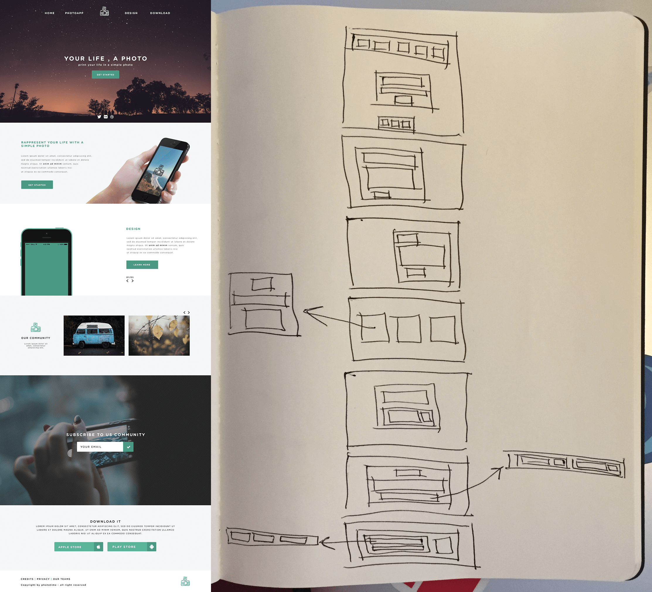
Blocking Out a Design
Using a pen or pencil, block out each element on the page
Markup
- Write markup, but don't worry about content
- Ignore design elements and think about your various blocks
Styling
- Start simple!
- Stacking works best for mobile.
Let's Develop It!
- Open class-2/index.html and class-2/style.css.
- Write the markup for our second sections.
- Make it look great in mobile, first!
- Then move on to the other breakpoints to make it look more like the design.
Responsive Images
Picture Element
<picture>
	<source srcset="http://placehold.it/800x800" media="(min-width: 800px)">
	<source srcset="http://placehold.it/500x500" media="(min-width: 500px)">
	<img src="http://placehold.it/200x200" alt="" />
</picture>
https://developer.mozilla.org/en-US/docs/Web/HTML/Element/picture
Let's Develop It!
- Create three versions of the same image.
- Use the <picture> element to create a responsive image of your own!
Homework
- Pick out three templates from Freebies Bug.
- Use pen & paper to:
- block out the elements on the page
- use those blocks to create a mobile wireframe
- Take one of the templates and create it using HTML/CSS (mobile first!).
Q&A
- What questions do you have?
- Do you need further clarification?
- Have anything you’d like to show the class?
- What do you want to learn next week?
Class 3
CSS Frameworks
But first!
Homework review
Bootstrap
- http://getbootstrap.com
- Originally developed for Twitter
- Tons of resources
- Can feel bloated for a small project
Foundation
- http://foundation.zurb.com/
- Different versions for sites, emails, and apps
- Optional flexbox grids
- Longer class names
Semantic UI
- http://semantic-ui.com/
- Gulp-ready (latest and fastest compiling of Sass)
- User interface focused
- Flexbox grids
Let's develop it!
Use one of the above frameworks to create this website:

Q&A
- What questions do you have?
- Do you need further clarification?
- Have anything you’d like to show the class?
- What do you want to learn next week?
Class 4
Flexbox, in depth
How does it work?
Flexbox basics
The flexbox layout consists of:
- The parent (the flex container)
- its immediate children (the flex items).

Good to know:
By default, flexbox items are displayed in a row, left-to-right (ltr).
Let's develop it!
Copy the HTML below into a new pen in Codepen.io
	<div class="flex-container">
		<div class="flex-item">flex item 1</div>
		<div class="flex-item">flex item 2</div>
		<div class="flex-item">flex item 3</div>
	</div>
We are setting up a flex container with three flex items.
Now copy this CSS.
We're giving our items a width and height (and background color so we can see them).
	.flex-container {
	}

	.flex-item {
	    background-color: #bada55;
	    width: 100px;
	    height: 100px;
	    margin: 10px;
	}
Make it Flex!
To use the flexbox layout, simply set the display property on the parent element.
display: flex;
What happened?
All the items are now flexbox items, and they are aligned LTR in a straight line. Now let's finish our container:
- Give it a background color (A nice one, like #ddd)
- Give it a width of 500px
- Give it a height of 300px
Flexbox container properties
We're going to split up the flexbox properties. The following properties apply to the container.
flex-direction
Display items in a line horizontally or vertically. Values:
- row: LTR
- row-reverse: RTL
- column: Top to bottom
- column-reverse: Bottom to top
Let's try it on our flex container:
flex-direction: row-reverse;
flex-wrap
Flex will ignore our items' width by default. Add three more flex items. What happened?
Let's make them wrap. Add this to the flex container:
flex-wrap: wrap;
flex-flow
Shorthand for flex-direction and flex-wrap. Flex direction always goes first.
	flex-flow: column nowrap;

	- or -

	flex-flow: row wrap;
justify-content
Aligns items along the main axis (x-axis). Values:
- flex-start: Align to the left
- flex-end: Align to the right
- center: Center of the container
- space-between: Distributed, no space left and right
- space-around: Every item has same margin around
justify-content
Try it out! Delete the three extra items so there are only three. Add the justify-content property to the container.
	justify-content: flex-end;

	- or -

	justify-content: space-between;
align-items
Same as justify-content, but along the cross axis (y-axis). Also allows for vertical stretching of items:
- stretch: Items fill the whole height (or width) of their container. Items must not have a height!
- flex-start: Align to top
- flex-end: Align to bottom
- center: Center vertically (!)
- baseline: Text baselines are aligned

align-items
Try it out: change the alignment of your elements to stretch:
align-items: stretch;
What happened? Now take the height off of our items and try again...
Flexbox item properties
Here are the properties that apply to the flex items
order
Allows you to change the order in which items appear, regardless their order in the markup.
The value is any integer. Example:

flex-grow
This property specifies the flex grow factor, which determines how much the flex item will grow relative to the rest of the flex items in the flex container when positive free space is distributed.
Make sense?
Example: All items have the same value for flex-grow:

Here, the second items takes up more room relative to its neighbors:

flex-shrink
Simiar to flex-grow. If the item has a set width which is being overwritten by flex, flex-shrink: 0 will allow it to keep its original width.
The auto (the default value) keyword means "look at my width or height property"
flex-shrink
Tyr it out: Add three more items so they all get squished, and add a class to one of them.
Next, set that new class to flex-shrink: 0;. What happened?
flex-basis
Takes same values as width or height. It sets the initial size of a flex item before space is distributed among the other items.
Try it:
- Make it so you have 5 flex items
- Give one of them a new class
- Set that item's flex-basis to 300px
What happened?
flex
Put it all together! flex is a shorthand property for flex-grow, flex-shrink, and flex-basis:
	.flex-item {
	  flex: 0 0 auto
	}
Q&A
- What questions do you have?
- Do you need further clarification?
- Have anything you’d like to show the class?